Revamping Postman’s notification center
Creating structure to help users organize their work.
Project goals
As part of the Growth Design team, my goal was to improve retention and conversion through content by driving developer collaboration on Postman. I focused on guiding users from the free plan to the Team Collaboration plan by making collaboration features more visible and valuable.
My team pinpointed the Notification Center as a key area for growth, aiming to drive actions like sending and accepting team invites. By optimizing this feature, we achieved a 13% increase in notification usage and a 15% boost in invite acceptance, leading to higher team collaboration and upgrades.
The project’s success was measured by increased feature interaction, along with improvements in long-term retention and conversion.
Context
Product
Postman is a platform for designing, testing, and documenting APIs. It helps developers send requests, inspect responses, automate tests, and collaborate with teammates and partners.
The team
UX writer (moi)
Product designer
Project manager
Data analyst
Software engineers
My role
As a Senior UX Writer, I was responsible for:
Evaluating existing user flows and information architecture.
Collaborating with teammates to define, create, and deliver experiments.
Ensuring content was scalable, adaptable, and easy to update across different platforms.
Digging deep
👁🗨 Quantitative dive
With the help of our data analyst, we were able to pull out some key data to help us understand the problem:
Only 0.8% of users engage with the Notification Center week over week (WoW).
Users who engage with notifications are 30% more likely to convert and retain, highlighting the importance of improving this feature.
Users are more likely to disable email notifications over in-app notifications, indicating a preference for in-app engagement.
Less than 50% of team users are active week over week, signaling an opportunity to boost team collaboration and retention.
Why 0.8 % only?
💬Qualitative dive
To figure out why only 0.8% of our users engage with the Notification Center, I decided to dig deeper:
1- I documented all notifications (over 200) to analyze existing content.
2- I ran a heuristic evaluation with the designer.
3- I surveyed our users to gain more insight.
My research focused on evaluating three heuristics that were relevant to content:
-
1- Visibility of System Status
In the survey, many users shared that they’re often notified about things that don’t really matter to them, which makes them less interested in checking notifications at all. They mentioned getting updates about activity in workspaces they’re not even part of or actively following.

-
2- Match Between the System & the Real World
We noticed that the way notifications are stacked chronologically isn’t really helping users prioritize effectively. When we surveyed users, they mentioned they’d much rather see actionable notifications—like when they’re tagged in a comment—show up before less important updates.

-
3- Consistency and Standards
Some notifications included technical terms like 'Pull,' 'Fork,' and 'Merge.' Our survey didn’t reveal any issues with this terminology, so assessing comprehension wasn’t a priority for this project.

Market analysis
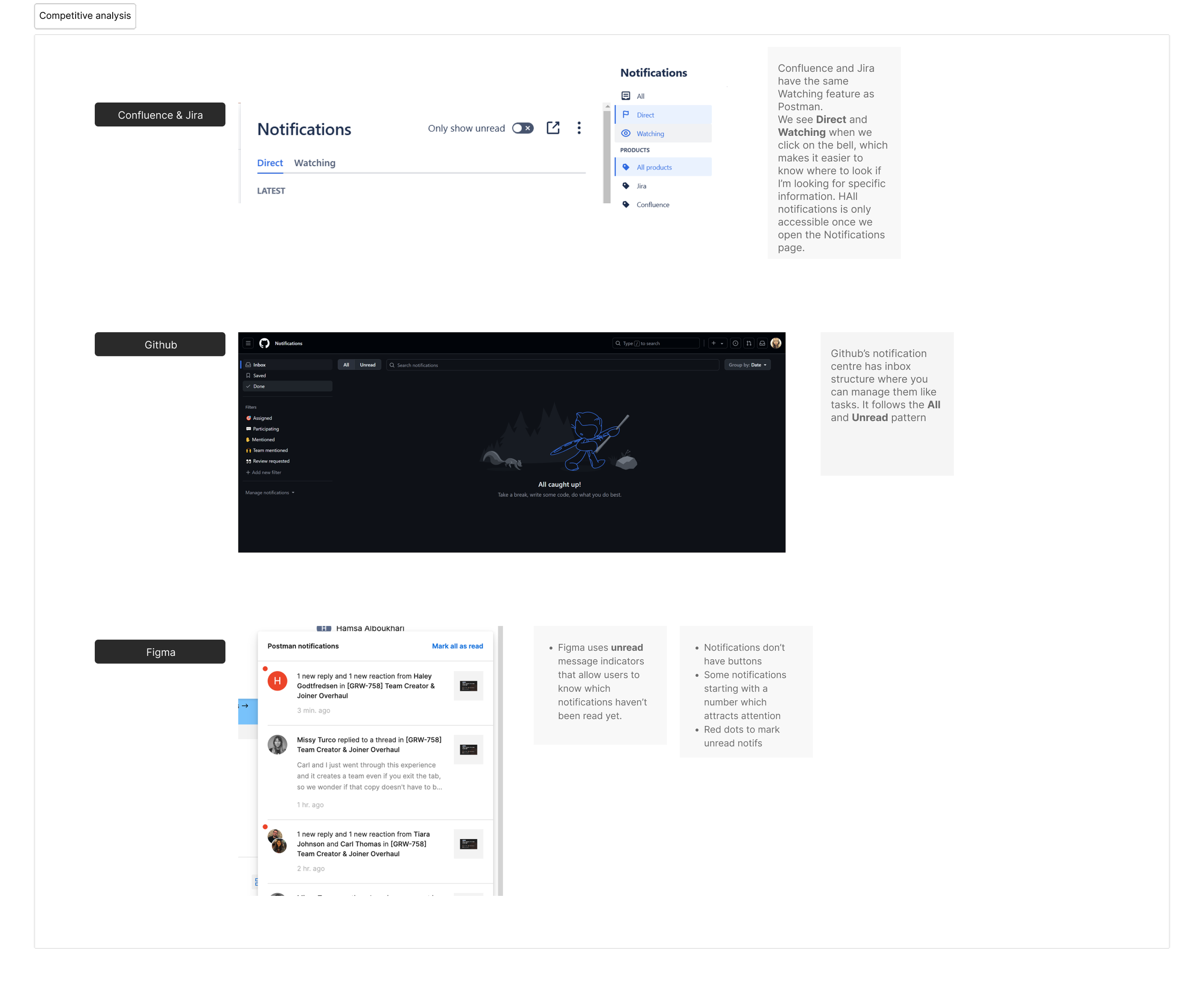
These findings highlighted a high-level issue with the logic of our notification feed and the need for better organization. However, we weren’t certain about the ideal presentation or naming for notification categories. So, I conducted market research, documenting methods from products developers are likely familiar with, such as Confluence, Bitbucket, GitHub, Jira, GitLab, and AWS, as well as tools like Discord, Slack, Figma, and various social media platforms.
Hypothesis & goals
From these findings, we defined a hypothesis and goals.
Business goal
An increase in user engagement with notifications and in-app alerts can lead to an increase in retention and conversion.
User goals
As an engineer, I want to receive frequent updates on key changes relevant to my work, so I can stay informed and quickly adapt my tasks to maintain efficiency and accuracy.
As a workspace admin, I want to be made aware of important events within my team so I can intervene quickly and ensure smooth collaboration.
Hypothesis
Improving the visibility and organization of the notification center will boost user engagement and perceived value. By offering clearer direction and prioritizing actions, users will find it easier to navigate and stay engaged, ultimately supporting higher retention rates.
Now let’s design …
Logic #1
Based on these findings, I created two proposals of the possible logical structures for our notification center.
Segmentation
This logic focused on segmenting the notifications into 3 categories: Direct, watching, and all.
Pros: users would have clear expectations as to what they will see when interacting with each section and can easily access relevant information.
Cons: some notifications might get hidden and would be harder to see, making discoverability of other workspaces a bit harder.
Logic #2
All/ unread
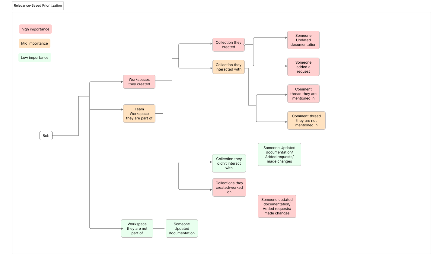
In this revised "All Notifications" concept, notifications are not simply listed chronologically. Instead, they use an algorithmic approach tailored to the user's behavior and their interactions across team workspaces. I categorized notifications into three tiers of importance, ensuring they are contextually relevant and highlight what matters most to the user.
Pros
Eliminating tabs reduces the chance of missing notifications, offering a unified view.
Algorithmic prioritization ensures users see the most important updates first.
By surfacing relevant activity, users are more likely to interact with their team’s work.
Cons
Finding specific notifications might be difficult without clear sorting.
Inaccurate prioritization could show irrelevant updates.
Important updates risk being buried if the algorithm over-prioritizes certain items.
We decided to test the first option because we felt that classifying notifications created the structure our users expressed wanting in the survey.
What we tested
Results
13%
Increase in-app notification usage
15%
Increase in invite acceptances
The leadership decided to move forward with the general availability (GA) of this design due to its strong performance and positive user feedback.😊


